Why ‘Mobile-Friendly’ Isn’t Enough Anymore (What to Do Instead)
Why 'Mobile-Friendly' Isn't Enough Anymore: The Mobile-First Revolution Your Website Needs
Picture this: You're rushing to catch a train, fumbling with your phone to check if your favorite restaurant is open. You click on their website, and… it loads slowly, the buttons are tiny, and you can't find the hours anywhere. Frustrating, right? That's the difference between a "mobile-friendly" site and one built for the mobile-first world we live in today.
If your website simply shrinks to fit a phone screen, you're already behind. In 2025, users expect lightning-fast, intuitive experiences that understand exactly what they need—and search engines are rewarding sites that deliver just that.
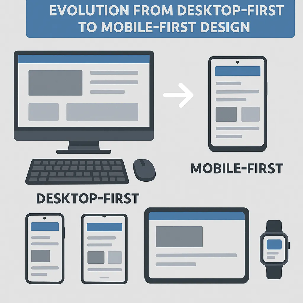
The Mobile-Friendly Trap: Why "Good Enough" No Longer Cuts It
Mobile-friendly used to mean your website didn't break on a phone. Today? That's like saying your car is "road-friendly" because it has wheels. Here's what's changed:
Device diversity has exploded: We're not just talking phones anymore. Foldable screens, tablets, smartwatches, and devices we haven't even invented yet—each with unique capabilities and user contexts
Speed expectations are through the roof: Users abandon sites that take longer than 3 seconds to load, and that's being generous
Google's mobile-first indexing: Since 2024, Google ranks your site primarily based on its mobile experience, not desktop
Accessibility isn't optional: Small buttons, poor contrast, and hard-to-read fonts don't just frustrate users—they exclude them entirely

What Mobile-First Actually Means (And Why It Changes Everything)
Think of mobile-first design like packing for a backpacking trip. You start with only the essentials that fit in your smallest bag, then add extras only if you have more space. This approach forces you to prioritize what truly matters to your users.
Start Small, Think Big
Design for the smallest screen first, then scale up
Every element must earn its place—no room for clutter
Test on real devices, not just browser emulators
Focus on what users actually need, not what you want to show them
Context Is King
Modern mobile users aren't just smaller-screen desktop users. They're:
On the move: Walking, commuting, multitasking
Goal-oriented: Looking for specific information quickly
Impatient: Willing to bounce if things aren't immediately clear
Diverse: Using assistive technologies, different languages, various connection speeds

The New Rules: What to Do Instead
Rule 1: Performance Is Everything
Fast loading isn't a nice-to-have—it's survival. More than half of mobile users abandon sites that take over 3 seconds to load. That means:
Optimize images ruthlessly: Compress, resize, and serve the right format for each device
Minimize code: Every byte counts when someone's on a slow connection
Prioritize critical content: Load what users see first, everything else second
Rule 2: Design for Thumbs, Not Cursors
Your users aren't precision-clicking with a mouse—they're tapping with their thumbs while walking:
Make buttons thumb-sized: At least 44 pixels, with plenty of space between them
Put important actions within thumb reach: The bottom of the screen is prime real estate
Use familiar gestures: Swipe, pinch, tap—work with muscle memory, not against it
Rule 3: Context-Aware Experiences
Smart websites adapt to their users automatically:
Location-based content: Show nearby stores, local weather, relevant events
Connection-aware loading: Serve lighter content on slower networks
Time-sensitive information: Highlight what's relevant right now

Beyond Mobile-First: The Accessibility Advantage
Here's something many businesses miss: accessible design isn't just about compliance—it's about reaching more customers. When you design for users with disabilities, you create better experiences for everyone:
High contrast colors help in bright sunlight
Large, clear fonts reduce eye strain for all users
Voice navigation works great when hands are busy
Simple, logical layouts benefit users with cognitive differences
Making the Switch: Your Action Plan
Ready to leave "mobile-friendly" behind? Here's where to start:
Audit your current site: How does it really perform on various devices?
Identify your mobile user goals: What do they need most urgently?
Redesign your most important page using mobile-first principles
Test with real users on real devices in real situations
Measure and iterate: Track performance, bounce rates, and user feedback

The Bottom Line: Future-Proofing Your Digital Presence
The shift from mobile-friendly to mobile-first isn't just about keeping up with trends—it's about meeting your users where they are and how they actually behave. In a world where smartphones are many people's primary (or only) internet access point, designing for mobile isn't an afterthought—it's the foundation.
Your website isn't just competing with other websites anymore. It's competing with apps, with voice search, with whatever new technology comes next. By embracing mobile-first principles—fast, accessible, context-aware design—you're not just improving your mobile experience. You're building a digital presence that can adapt to whatever comes next.
The question isn't whether your site works on mobile. It's whether your site works so well on mobile that users prefer it to your competitors. That's the difference between surviving and thriving in 2025.
